Welcome, pizza-loving developers and Teenage Mutant Ninja Turtles enthusiasts! Today, we’re embarking on an epic journey to create a totally radical TMNT-Themed Website Development using HTML, CSS, and JavaScript. This is a creative and fun way to learn about basic website coding, so strap on your virtual ninja masks and get ready to channel your inner Michelangelo because we start this process right now!
Note that this project is optimized to run on your computer in a desktop environment. As the community makes some changes, it may become mobile user-friendly, but for now, get some of the following prerequisite items ready. There is functionality issues with Safari Browsers at this time when running the current video player. Use Chrome, Edge, or Firefox until the code is optimized as you learn to use it.
What We're Building
We’re building a Teenage Mutant Ninja Turtle-themed pizza website for “Ninja Turtles Pizza.” This website will include sections for the homepage, menu, an embedded arcade game, an embedded TV episode, an about us, contact information, order page, employee login, FAQ Section … and other upcoming sections.
Prerequisites: Before we dive into the pizza-making (coding) process, make sure you have the following ingredients (software/tools):
- – A code editor e.g., Visual Studio Code, Notepad, or Notepad ++ (I recommend VS Code .. it’s free)
- A web browser
- The downloaded code for the site from my Github, located here: GitHub – SeanRiggs/TMNT-Theme-Site: Learn to code HTML, CSS, and JavaScript with this TMNT Themed Site
- The TMNT Pizza Company demo site open on a tab in your browser, located here http://tmntpizzaco.com (Great to look at for example)
- A sprinkle of creativity and a passion for pizza and turtles!
Setting up the Basics
HTML Structure:
We start with the basic HTML structure for the TMNT-Themed Website Development. Ensure you have downloaded my GitHub file with the provided code and unzip it to a location you can remember. After you unzip my code, you can navigate to the file labeled “index.html.” Double-click this file, which should open in your default web browser. This is the current, complete working site that you can use to make changes to, customize to make your own, and commit changes to the GitHub repository for any suggested improvements you make! You can compare your home computer changes to the demo site to see the differences (tmntpizzaco.com). Don’t forget that as you change your code locally, save the file and refresh your browser window to see what changed!
Back to the HTML file, “index.html”. In this part, you’re setting up the basic structure of your HTML document. You include metadata like character encoding and the viewport (your browser) for responsive design. The title tag defines the title of your webpage, which appears in the browser’s tab, and this is also where you can load a favicon and an external CSS file to style your page. You can see this in my example code under index.html (open your code editor to see the code).
Adding CSS and JavaScript:
So, what is CSS then … and what is JavaScript?
CSS, which stands for Cascading Style Sheets, is like the fashion designer of a website. It’s a technology used to control how a web page looks and feels. CSS allows you to change things like colors, fonts, spacing, and layout to make a website visually appealing and organized. So, it’s all about making web pages beautiful and user-friendly by controlling their visual appearance.
JavaScript is a programming language that adds interactivity and functionality to websites. It allows developers to create dynamic and interactive elements on webpages, such as forms, animations, and interactive buttons. JavaScript is executed by the user’s web browser, enabling websites to respond to user actions in real-time without needing to communicate with the server. It is widely used for web development and is an essential tool for creating engaging and interactive web experiences.
The necessary style sheets (style.css) and JavaScript code for the scroll-to-top button are also included with my files. Open the style.css sheet in my code to take a look (open in code editor). You can also open any of the .js files to see how the format looks.
For now, let’s jump back to the index.html code to do a quick overview of what the structure is so you can make your own changes.
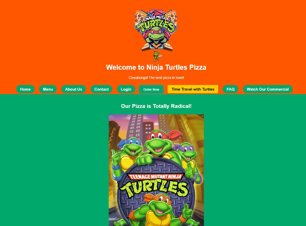
Creating the Header Section: The header section welcomes our visitors with the Ninja Turtles Pizza logo and a catchy slogan. You can replace “logo.jpg” with your own logo. Just remember to download your logo and add it to the images folder of your website file folder, or update the location to the img src= location below:
Navigating with the Turtles
<header>
    <img src="images/logo.jpg" alt="Ninja Turtles Pizza Logo" class="logo">
    <h1>Welcome to Ninja Turtles Pizza</h1>
    <p class="slogan">Cowabunga! The best pizza in town!</p>
</header>
Building the Navigation Section:
Our navigation section is where users can find their way around the website. We’ve added links to different sections, including an “Order Now” button and a “Time Travel with Turtles” game link. Take a look at the structure in your HTML and practice creating a link .. maybe we can make drop-down menus for all these links?
<nav>
    <ul>
        <!-- Add navigation links here -->
    </ul>
</nav>
Designing Navigation Links:
You can style the navigation links in your style.css file to make them look like buttons. Add classes like glowing-button and game-button for a fun touch (take a look at the style.css file).
.glowing-button {
    /* Style for "Order Now" button */
}

.game-button {
    /* Style for "Time Travel with Turtles" button */
}
Home Slice
Designing the Home Section:
The home section is where we showcase our delicious pizza and an exciting video. Customize the pizza image and video source with your own content. You can do this just like you did with the links and logos previously. Use index.html as an example again and add or remove these items as you see fit.
<section id="home">
    <!-- Add pizza image and video here -->
</section>
Adding Videos and Images:
Replace “tmnt_pizza.jpg” with your mouth-watering pizza image and “TMNT.mp4” with your video. remember to include the file locations as you did with the images previously. You can also add more pizza images to the menu section for variety.
When creating a web page, it’s important to consider the size and number of videos and large images you add. While videos and images can enhance the visual appeal and engagement of a website, it’s essential to strike a balance and not overload the page with too much multimedia content.
One reason for this, is the impact on page loading time. Large videos and images can significantly increase the file size of a web page, causing slower loading times. In today’s fast-paced digital world, users expect websites to load quickly. If a page takes too long to load, visitors may become impatient and navigate away, resulting in a poor user experience and potential loss of engagement or conversions.
Menu Magic
Crafting the Menu Section:
The menu section is where we creatively describe our pizza items. We have four pizza items here, but feel free to add more!
<section id="menu">
    <div class="menu-item">
        <!-- Pizza item 1 details -->
    </div>
    <!-- Repeat for pizza items 2-4 -->
</section>
Describing Pizza Items:
Each pizza item has a detailed description that paints a mouth-watering picture. Customize these descriptions and images to match your pizza offerings. Where did I get the strange pizza images from? I used AI! Try AI image platforms like Leonardo or Ideogram. They are still free for now and are a lot of fun for creating images for themes like this!
Time Travel with Turtles
Creating the Video Game Section:
The video game section is where we invite users to play the Ninja Turtles arcade game. You can embed your favorite TMNT game here.
<section id="videogame">
    <!-- Add game details and embed code here -->
</section>
Embedding the Arcade Game:
Replace the game’s embed code with your chosen TMNT arcade game. Don’t forget to mention any keyboard controls or tips for the game.
I found that the current embedded game online, allows anyone to play for free! I have also created my Ninja Turtles game which, I will link to shortly. I will integrate it into the site soon but is a good way to learn how to integrate web-based games made from HTML, CSS, and vanilla javascript … stay tuned for that.
Unmasking the Team
The About Us Section:
In the “About Us” section, we share our passion for pizza and introduce the team. Customize this section to tell your own unique pizza story.
<section id="about">
    <!-- Add about us details here -->
</section>
Celebrating the Pizza Artisans:
Your “About Us” section can describe your dedication to pizza perfection and the teamwork involved in creating each delicious pie.
Getting in Touch
Contact Us Section:
Finally, in the “Contact Us” section, users can find your contact information. Customize this section with your own email and phone number.
<section id="contact">
    <!-- Add contact details here -->
</section>
Providing Contact Information:
Make sure your email and phone number are functional. You can style this section to match the theme of your website. You will see on the demo site the email does work, but the phone number is fake… Should we create an interactive phone call with the turtles?
Finishing Touches
Designing the Footer:
Complete your website with a copyright notice in the footer. This ensures your content is protected.
<footer>
<p>© 2023 Ninja Turtles Pizza</p>
</footer>Adding a Scroll-to-Top Button:
The scroll-to-top button is a fun and practical feature. It lets users return to the top of the page with a single click.
<button id="scroll-to-top" title="Scroll to Top">Top</button>Customize the button’s appearance and behavior in your JavaScript code.
CSS
The provided style sheet (CSS) customizes the appearance and layout of your HTML document. Here is a description of what this style sheet does and some creative ways you can customize it:
Reset Default Styles:
body, h1, h2, p, ul {
    margin: 0;
    padding: 0;
}
This section resets some default styles to ensure a consistent starting point for styling your page. This is a common add-to style sheets to accommodate for different browsers and their default margins.
Page Styles:
body {
    font-family: Arial, sans-serif;
    background-color: #00A86B;
    color: #fff;
    line-height: 1.6;
    text-align: center;
}
It sets the overall font family, background color, text color, line height, and text alignment for the entire page.
Header Styles:
header {
    background-color: #FF5700;
    padding: 20px;
}
This styles the header section with an orange background and padding.
Navigation Styles:
nav ul {
    list-style-type: none;
    background-color: #FF5700;
}

nav li {
    display: inline;
    margin-right: 20px;
}

nav a {
    text-decoration: none;
    color: #fff;
    font-weight: bold;
}
It styles the navigation menu with a list-style, background color, inline list items, and bold white text.
Section Styles:
section {
    padding: 40px 0;
}

section h2 {
    font-size: 28px;
    margin-bottom: 20px;
}
This sets padding for sections and styles section headings.
Menu Item Styles:
.menu-item {
    display: flex;
    flex-direction: column;
    align-items: center;
    margin-bottom: 20px;
}

.menu-item img {
    max-width: 100%;
    height: auto;
    border-radius: 10px;
    box-shadow: 0px 0px 5px rgba(0, 0, 0, 0.3);
}

.menu-item h3 {
    font-size: 24px;
    margin-top: 10px;
}

.menu-item p {
    font-size: 16px;
    text-align: center;
    margin-top: 10px;
}
These styles are applied to menu items. They are displayed in a flex column layout with centered content, and menu item images have a shadow and rounded corners.
Video Container Styles:
.video-container {
    position: relative;
    width: 100%;
    max-width: 500px;
    margin: 0 auto;
    overflow: hidden;
}

.video-container video {
    width: 100%;
    height: auto;
}

.video-container img {
    /* Styles for an alternative image if the video is not supported */
}
These styles are for a video container, ensuring that videos are responsive and centered, with an alternative image if the video isn’t supported.
Footer Styles:
footer {
    background-color: #FF5700;
    padding: 10px 0;
}
This styles the footer with an orange background and padding.
Glowing Button Styles:
.glowing-button {
    /* Styles for a glowing button with an animation */
}
These styles create a glowing effect for buttons.
Customized Navigation Button Styles:
/* Styles for the navigation buttons */
nav a {
    /* Custom styles for navigation buttons */
}

nav a:hover {
    /* Styles for navigation button hover effects */
}
You can further customize the navigation buttons with your desired colors, fonts, and hover effects.
Scroll-to-Top Button Styles:
/* Styles for the scroll-to-top button */
#scroll-to-top {
    /* Custom styles for the scroll-to-top button */
}

#scroll-to-top:hover {
    /* Styles for the scroll-to-top button on hover */
}
You can customize the scroll-to-top button with your preferred colors and animations. This part can get more advanced, but try playing with it, and search the web for different ideas.
Description Box Styles:
.description-box {
    max-width: 600px;
    margin: 0 auto;
}
These styles define a maximum width and center alignment for description boxes.
Game Button Styles:
/* Style for the "Time Travel with Turtles" button */
.game-button {
    /* Custom styles for the game button */
}

/* Hover effect for the button */
.game-button:hover {
    /* Custom hover styles for the game button */
}
Customize the game button’s appearance and hover effect to match your website’s theme.
These are just some creative examples of customizing the provided style sheet. You can adjust colors, fonts, sizes, and animations to make your website unique and visually appealing. CSS can be challenging to understand but it can be very powerful. Searching the internet for style sheet examples is fun, a lot of information, and ideas can be found there.
Another thing I wanted to touch on. You will notice that the menu, home, Turtles in Time Video Game, about us, and contact us buttons are links to sections on the main page (index.html) that help you navigate there quickly. We call these anchors. This is why dividing your HTML into sections helps organize your page.
Here’s how anchors work:
Navigation Links:
<li><a href="#home">Home</a></li>
<li><a href="#menu">Menu</a></li>
<li><a href="#about">About Us</a></li>
<li><a href="#contact">Contact</a></li>
<!-- ... Other navigation links ... -->
Each navigation link is represented as a list item (<li>) within an unordered list (<ul>) and is an anchor (<a>) element with an href attribute pointing to a specific section on the page using the # symbol followed by the section’s ID. For example, href=”#contact” points to the “Contact Us” section.
Sections with IDs:
<!-- Home Section -->
<section id="home"> <!-- Content of the Home section -->
</section>
<!-- Menu Section -->
<section id="menu"> <!-- Content of the Menu section -->
</section>
<!-- About Us Section -->
<section id="about"> <!-- Content of the About Us section -->
</section>
<!-- Contact Us Section -->
<section id="contact"> <!-- Content of the Contact Us section -->
</section>
Each section of the webpage that you want to navigate to has a unique id attribute assigned to it. For instance, the “Contact Us” section has the id=”contact” attribute.
How Navigation Works:
When a user clicks on one of the navigation links, such as “Contact,” the browser looks for the section with the corresponding id attribute, in this case, “contact.” It then scrolls to that section, making it visible.
For example, clicking on the “Contact” link (<a href=”#contact”>Contact</a>) will scroll the page to the section with id=”contact”:
<section id="contact"> <!-- Content of the Contact Us section -->
</section>
This allows users to easily navigate to different sections of the webpage by clicking on the navigation links without the need for separate pages or complex JavaScript code.
Using these HTML anchors and unique IDs, creates a one-page scrolling experience where users can jump to specific sections of your webpage with a simple click on the navigation links.
The scroll-to-top button in the HTML code is a handy feature that allows users to quickly scroll back to the top of the webpage with a single click. Let me explain how it works:
How the Scroll-to-Top Button Works:
Button Element Creation:
In the HTML code, a button element is created with the following properties:
<button id="scroll-to-top" title="Scroll to Top">Top</button>id=”scroll-to-top”: This assigns a unique identifier to the button, making it easy to select and manipulate using JavaScript or CSS.
title=”Scroll to Top”: The title attribute provides a tooltip text that appears when you hover your mouse over the button, indicating its purpose.
Button Styles:
The button is styled using CSS to control its appearance, including its position, color, and size. Here’s the CSS code for styling the button:
#scroll-to-top { display: none; position: fixed; bottom: 20px; right: 20px; background-color: #FF5700; color: #fff; border: none; border-radius: 50%; cursor: pointer; font-size: 18px; width: 40px; height: 40px;
}
This CSS code hides the button by default (display: none;) and defines its appearance (color, size, position, etc.).
JavaScript Functionality
JavaScript is used to control when the button is displayed and how it behaves when clicked. Here’s the JavaScript code:
var scrollToTopBtn = document.getElementById("scroll-to-top");
window.onscroll = function() { if (document.body.scrollTop > 20 || document.documentElement.scrollTop > 20) { scrollToTopBtn.style.display = "block"; } else { scrollToTopBtn.style.display = "none"; }
};
scrollToTopBtn.onclick = function() { document.body.scrollTop = 0; // For Safari document.documentElement.scrollTop = 0; // For Chrome, Firefox, IE, and Opera
};
The document.getElementById("scroll-to-top") line selects the button element by its id.
The window.onscroll function listens for scroll events on the webpage. When the user scrolls down 20 pixels from the top of the document, it displays the button (scrollToTopBtn.style.display = "block"). Otherwise, it hides the button.
The scrollToTopBtn.onclick function defines what happens when the button is clicked. It scrolls the document back to the top by setting both document.body.scrollTop and document.documentElement.scrollTop to 0. This ensures cross-browser compatibility.
Button Usage:
As a result, when users scroll down the webpage, the button remains hidden. But the button becomes visible when they scroll past 20 pixels from the top. Clicking the button then smoothly scrolls the page back to the top.
In summary, the scroll-to-top button is a user-friendly feature that enhances the webpage’s usability. It’s implemented using HTML, CSS, and JavaScript to provide a smooth scrolling experience for users, allowing them to easily return to the top of the page with a single click.
This site’s basic functionality applies to any pages you add and link to. In the Menu, you will see buttons that take you to different pages vs. links. These other pages are included in the code, and the functionality is the same as the main page but includes separate JavaScript files that can be manipulated.
Single Page vs. Multiple Pages
This begs the question: When do I use a single page vs. multiple page website? Well, here are some things to consider:
Single Scrolling Web Page:
Use a single scrolling web page when you want to tell a story or share information in a linear, continuous flow. It’s like reading a book where you turn one page after another. This is great for:
- Simplicity: It keeps everything in one place, making it easy for visitors to scroll through and find what they need.
- Engagement: It can create a seamless and immersive experience, perfect for storytelling or guiding users through a process.
- Mobile-Friendly: Works well on mobile devices as users can scroll without clicking on multiple pages.
Multiple Page Website:
Use multiple pages when your content can be organized into distinct sections, like chapters in a book. Each page is like a different room in a house. This is useful for:
- Complexity: When you have a lot of content, dividing it into separate pages makes it less overwhelming.
- Navigation: Visitors can easily jump to the specific information they want by clicking on different links or tabs.
- SEO: Search engines can index each page separately, potentially improving your website’s visibility in search results.
You get to make that decision. We have both on our site to see the use of both. I like having a page template that helps keep the theme for multiple pages together when appropriate. You will see an HTML file labeled “template.html.” open it up in your browser and see the template before your content is added; copy and paste the code into a new file to start another page! Don’t forget to link the page, as we discussed earlier in your links section.
Where can I get assets for my site?
You can find pictures, videos, sprites, and background images from simple internet searches. I do not go to any central repository. I think of an image and google it. That is how I found the animated TMNT sprites! You can make your own in GIMP or Photoshop too. I made a little video on how to animate sprites using photoshop on YouTube! Less than a min, take a watch:
Hosting Your Website
You don’t have to post your site to the global internet; you can keep it on your computer for personal use. If you have improvements you want to see reflected on the demo site, submit a change request on my GitHub, and we can discuss and implement it. You may want to host it online; you can do that too! Here is a link to another post on how to do that for free. The blog post is about doing it for a genealogy site, but the process is the same: use your TMNT folder instead of the genealogy folder I talked about in the post.
I am hosting the TMNT-Themed Website Development demo site on a small server in my house. If demand gets high on the use, I will move it to the cloud, but really, websites like this are lightweight and there are many free options out there.
Conclusion
I want to say, Congratulations! You’ve just created a Teenage Mutant Ninja Turtle-themed pizza website from scratch, blending HTML, CSS, and JavaScript to create a fun and engaging online experience for your pizza-loving audience. Cowabunga, you’re now a semi-competent web developer …. maybe, but if not, there’s always WordPress! I hope you had fun following along! I hope you learned something new and help others learn as well. Please help to improve the TMNT-Themed Website Development demo site. I would love to see the incredible changes others come up with!
Don’t miss out on what is next either! I have also made my own TMNT themed video game made from HTML, CSS, and Vanilla JavaScript that we will add to the site as well! Get ready for more Ninja Turtle Action as we will keep learning together!
This is so freakin cool! And I love that it’s TMNT themed! How do you come up with these ideas?!